Trystahn Turner

Phonic Bloom

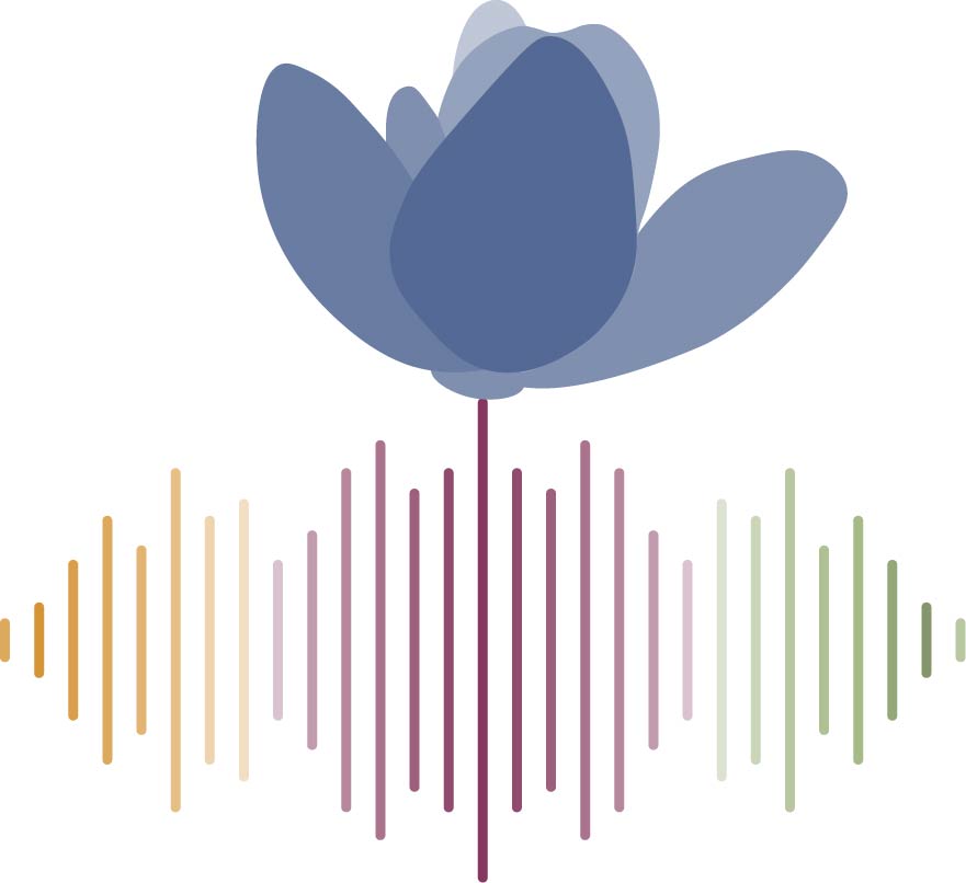
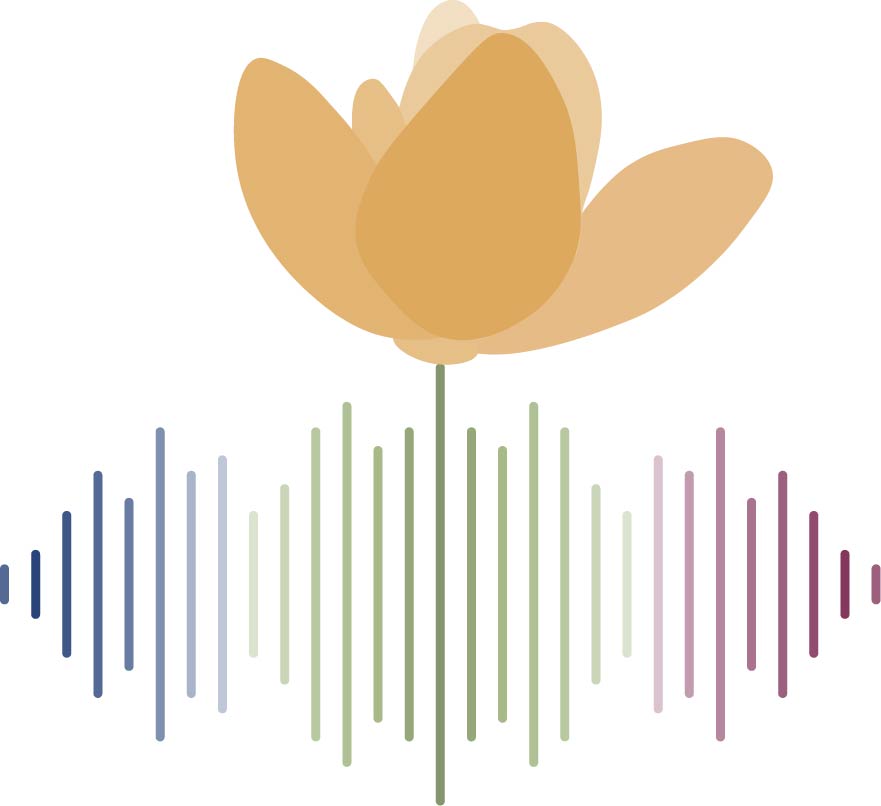
Phonic Bloom yellow flower version
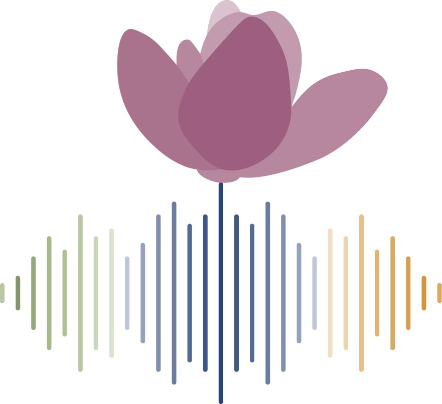
Phonic Bloom red flower version
Phonic Bloom blue flower version

This project involved many sounds and languages, however it focused on 3; English, Spanish, and Salish(Cowlitz). Each language was represented by a color, English being purple, Spanish yellow, and Salish blue. We used those 3 colors in our logo, along with green as a neutral plant color, however we didn't want to overshadow the other languages by putting emphasis on one of them. To do that we decided to randomize which version of the logo you saw when you entered the project site.

The colors we used were all taken from real flowers in the area surrounding the Woodland Library. Those colors and the art installation were all chosen and made by another group called Superfab, who worked with the library on setting up this project for us.

Continue down to see more content related to the creation process of the logo, including the original design I created.
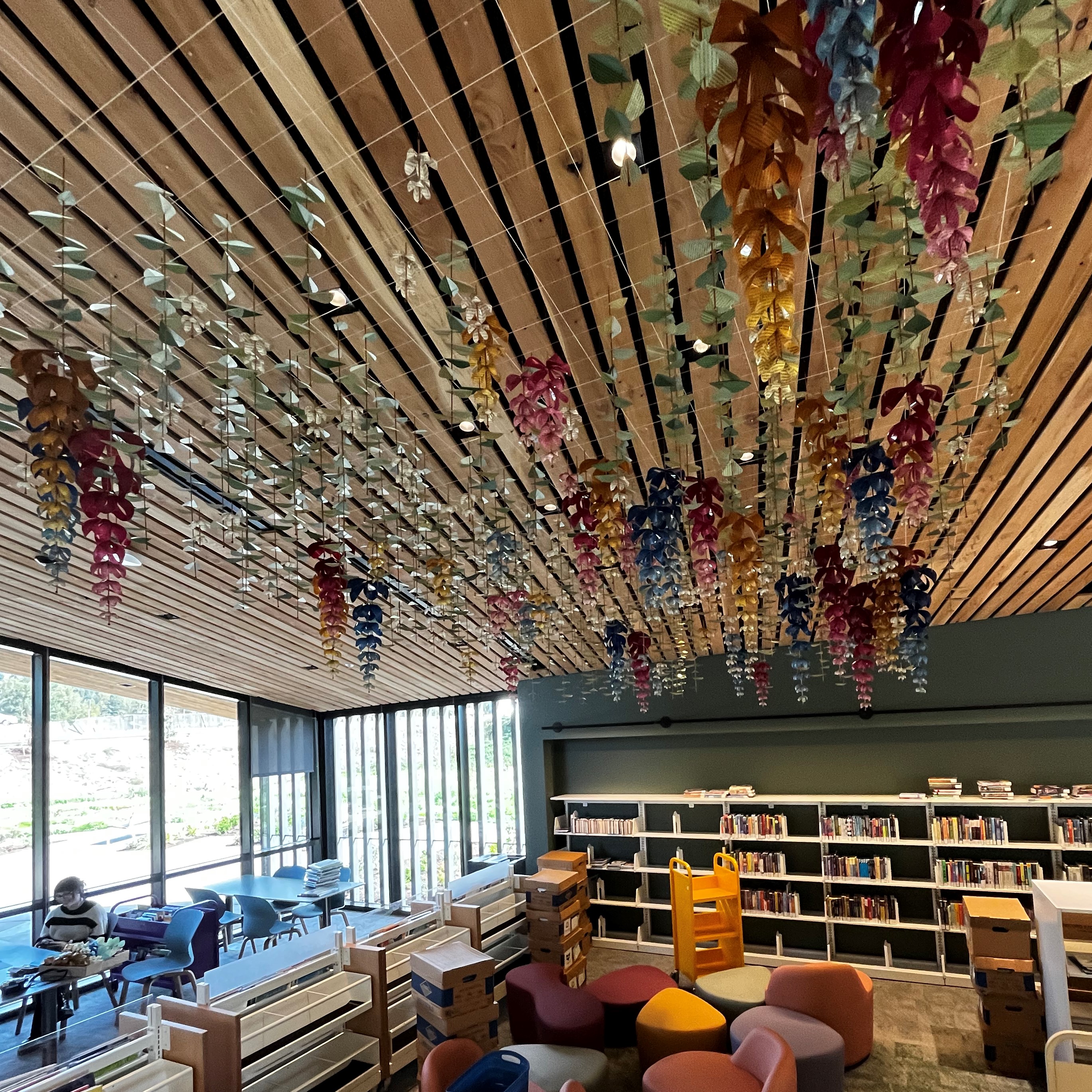
Here is an image taken of the Childrens reading room with the art installation hanging from the ceiling.

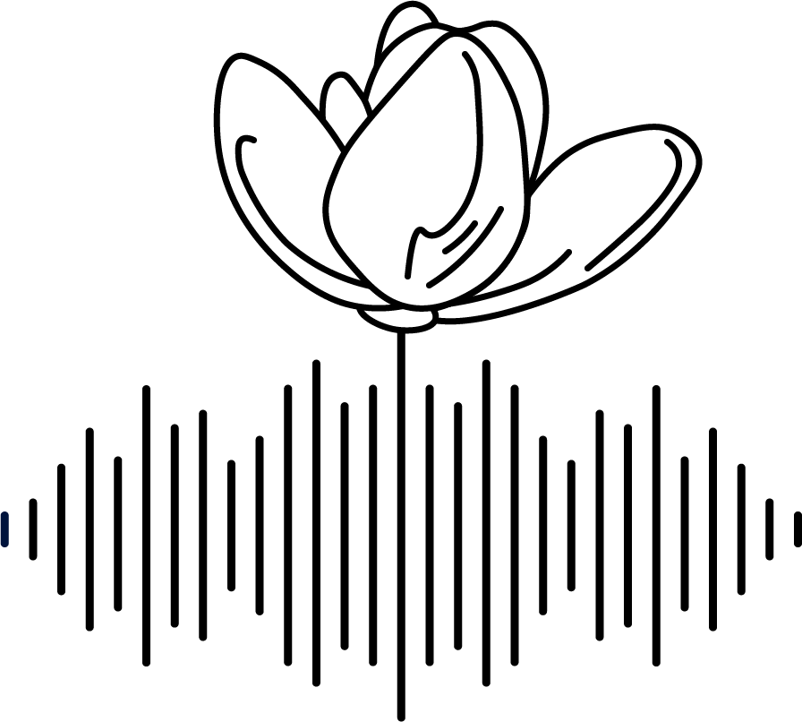
The first design of the Phonic Bloom logo

First Logo Design

This was the very first design I came up with. To come up with the idea I took inspiration from the flowers used in the sculpture and phonics which was the message of the sculpture. My original thought was to include some form of musical note in the logo but after lots of trial and error I couldn't figure out how to mix flowers with notes in a way that looked good. Eventually I decided to scrap that idea and think of something fresh. That's when the idea of a soundwave came to me. In my mind I had the idea of a blooming flower sprouting from a soundwave, with the soundwave taking the shape of the stem and leaves. Although it didn't turn out exactly like that It was fairly close to what we ended up with.

Adding the lines inside the petals was a way of adding a detail while keeping the simple and natural flowy-feel of the logo. The idea of the waveform being leaves was also dropped as it made the proportions feel off. After some quick touch ups it was sent in along with another concept made by a different design team member. As you can guess, it was chosen and we were finally able to move onto adding color.

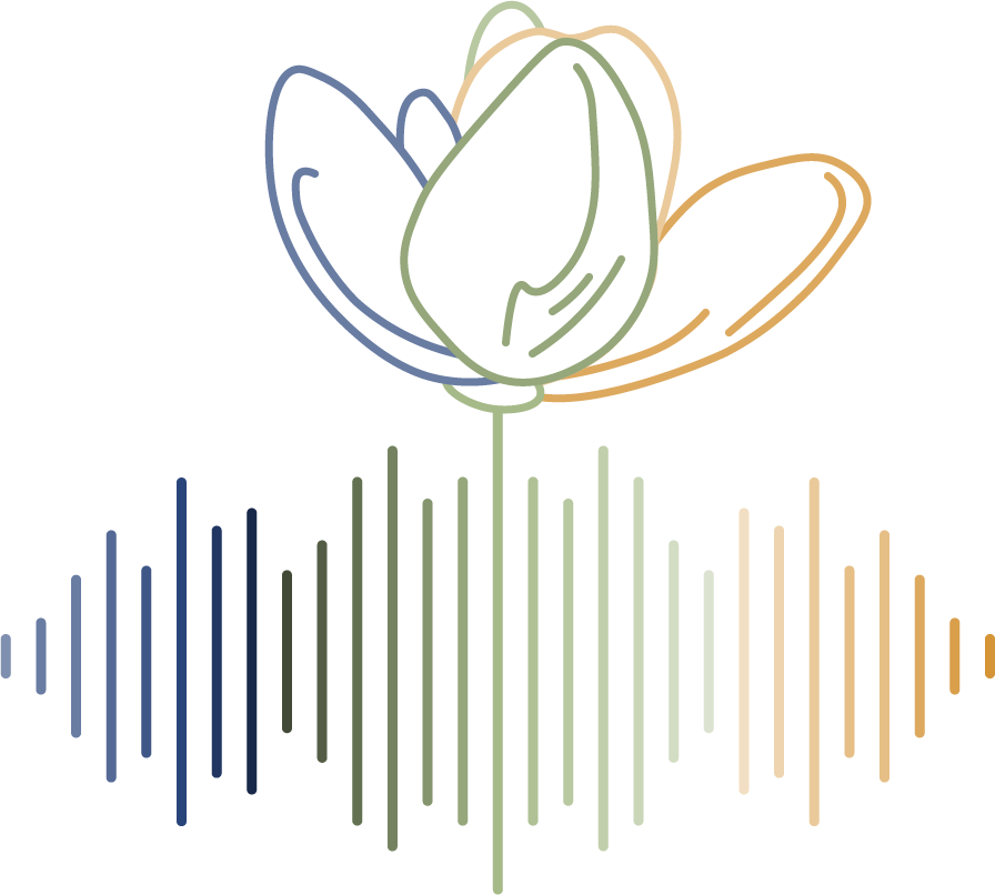
One of the first concepts for the logo with color

First Color Concepts

My first idea for the colored version was to have the entire logo be a gradient, with green being in the middle so it can act as the stem of the flower. Green also seemed to work well with the colors we had chosen. I originally had the gradient go light-dark-light-dark, but as you can see it wasn't quite right. The logo was off balanced and the colors didn't flow right with each other. My original idea for the flower petals being the different colors was okay, but we decided to switch that up too, and instead have the flower be the fourth color on its own. This would help it stand out from the soundwave and would incorporate all four colors.

After some editing we changed the gradient for the soundwave to have the darker colors on the outside, going in with the lighter colors until they met with the green in the middle. At that point the soundwave looked great but the flower still seemed off and having the petals be transparent or white didn't look great. We decided to fill in the petals with the color and scrap the lines altogether. We also experimented with making the flower petals different gradients of the fourth color, which looked awesome and is what we ended up going with for the final version.

This project was something new for me. I haven't had much group experience when it comes to making art, or at least not in a setting like this. Logos are also a newer topic for me and it taught me some key differences between making art and designing things. Most importantly though, it gave me insights about working in small groups and alongside other small groups. Something I will likely be doing a lot in the future.